A.P.C.
A.P.C.
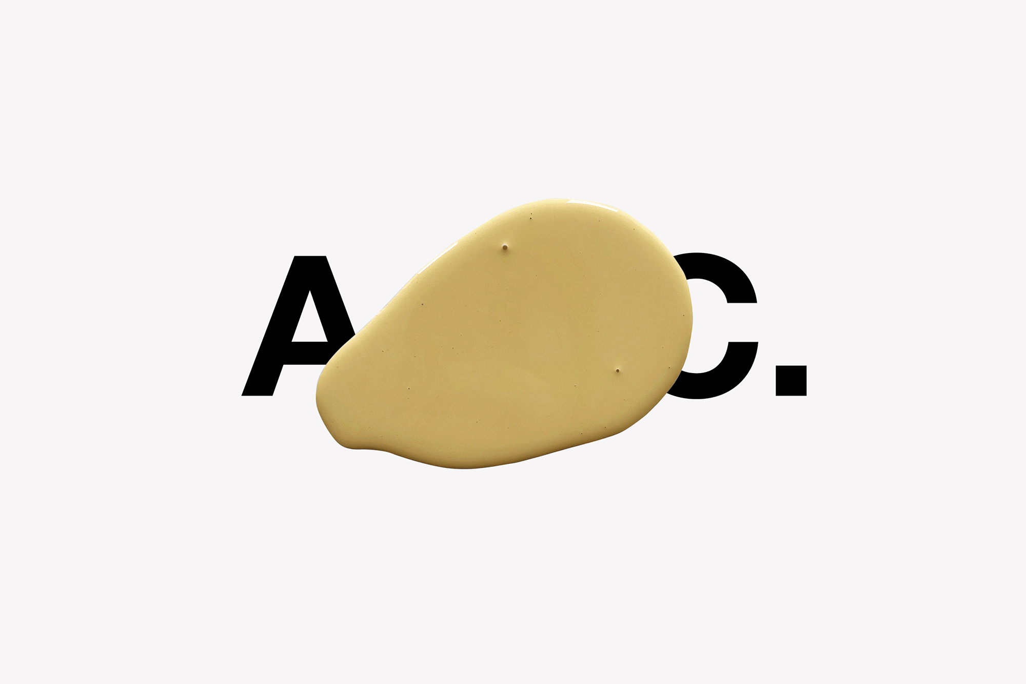
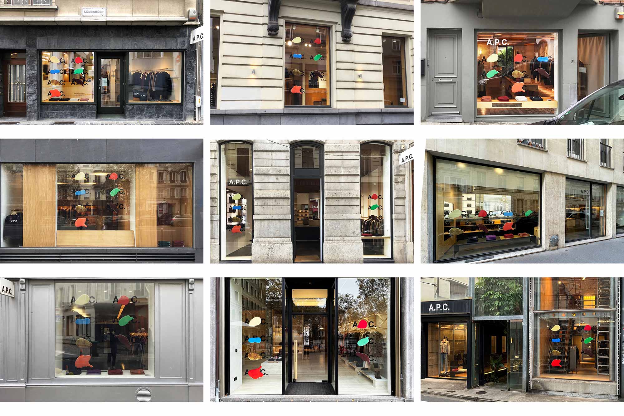
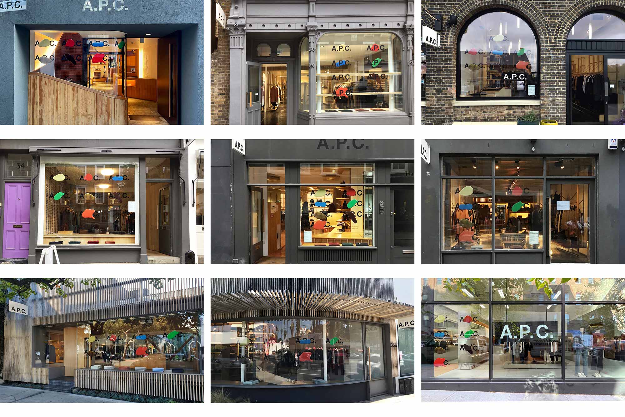
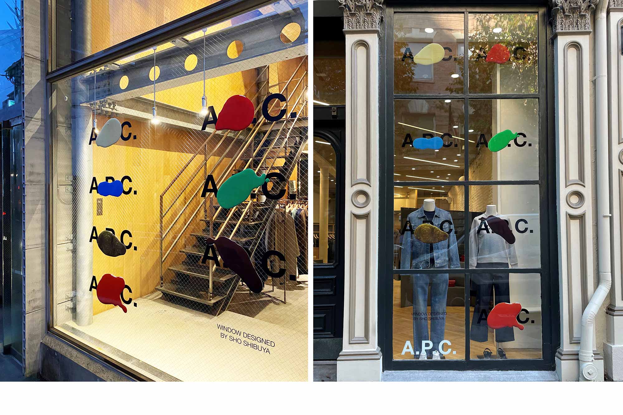
Placeholder collaborated with venerated French fashion label A.P.C. on two projects involving their iconic sans serif logo. In the first, the brand invited Sho to contribute a ‘new’ version of the logo graphic to be shared in media and printed on shirts. The collaboration continued with a store window design, displayed at A.P.C. stores around the world.
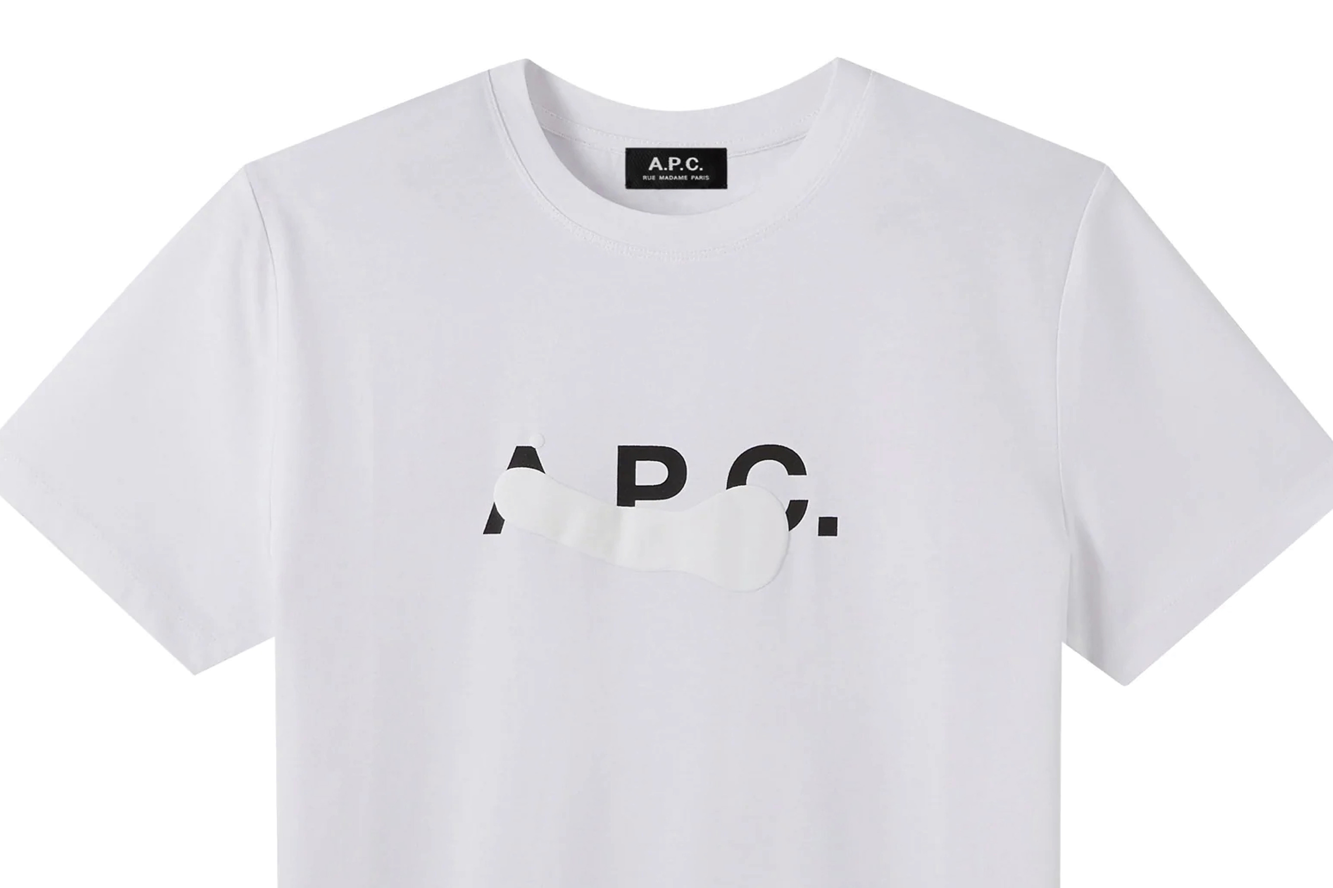
The first logo exploration found inspiration in found objects, textures, and aesthetics Sho came across in daily life in New York City: masking tape, peeling vinyl lettering, stencils, and drops of paint. They are all references to the idea that process is as important as product — translated to English, A.P.C. literally means “Production and Creation Workshop,” and “the brand attaches equal importance to both.”
For the store windows, we expanded upon the idea of a work in progress, assigning each day of the week a color based on the Japanese Kanji and Chinese characters, and creating a sequence of unique paint drops covering up the logo, one for each day of the week. In each application, we see the cycle of creation, and reveal a high regard for the how, as much as the what.
Copywriter: Cole Kennedy
Special thanks: Suzanne Koller and Camille Touitou
...MORE INFO
A.P.C.